Hidden Symbols and Iconography in Vintage Cigar Labels

Mythological Figures and Gods
Animal Allegories of Strength and Luxury
Political and Nationalistic Emblems
Floral and Botanical Symbolism
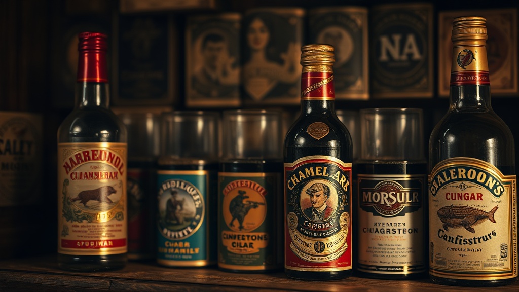
A collector picks up a mid-19th-century cigar box and notices a small, golden lion rampant staring back from the corner. To a casual observer, it's just a pretty drawing. To a serious paper and print enthusiast, that lion is a coded message about the brand's origin, quality, and intended social status. This post examines the specific visual languages used in vintage cigar labels, from the use of heraldic animals to the way color palettes signaled luxury to a specific class of consumer.
What are the most common symbols found on vintage cigar labels?
The most common symbols found on vintage cigar labels are heraldic animals, mythological figures, and botanical elements that represent strength, divinity, or exoticism. Brands used these icons to establish an immediate sense of authority and heritage, even if the company had only been in business for a decade. You'll see a lot of eagles, lions, and even gods like Mercury or Neptune used to suggest that the product inside is both powerful and transcendent.
Let's look at the specific categories of imagery that defined the golden age of cigar box art:
- Heraldic Beasts: Lions, dragons, and eagles were used to imply a lineage of quality. A lion doesn't just look "cool"—it suggests the brand is the king of its category.
- Mythological Figures: Figures from Greek and Roman mythology, like Apollo or Venus, were used to associate the product with timelessness and perfection.
- Exotic Landscapes: Illustrations of tropical jungles or distant mountains signaled the "exotic" nature of the tobacco, even if the consumer never left their home city.
- Agricultural Icons: Simple depictions of tobacco leaves or fertile soil were used to ground the brand in "natural" authenticity.
It's worth noting that these weren't just random choices. The artists were often working with very strict visual shorthand. If you see a figure holding a caduceus (the staff with two snakes), you aren't just looking at a man; you're looking at a symbol of commerce and negotiation. It's a layer of meaning that makes the paper art far more interesting than a simple advertisement.
If you want to understand the technical side of how these symbols achieved such vivid colors, you might want to check out the evolution of lithography in vintage cigar box labels. The precision of the print was just as important as the symbol itself.
How did color palettes signify luxury in 19th-century printing?
Color palettes signified luxury through the use of metallic-looking pigments, deep jewel tones, and high-contrast combinations that were difficult and expensive to print. In an era before digital color, achieving a deep crimson or a rich forest green required multiple passes of a printing press, making these colors a direct indicator of a premium product.
The cost of ink and the complexity of the print job determined how "expensive" a box looked. A label with a single color was a budget item. A label with a complex, multi-colored, gilded design was a statement piece. Here is a breakdown of how different colors functioned in the market:
| Color/Finish | Symbolic Meaning | Target Consumer Tier |
|---|---|---|
| Gold/Gilding | Wealth, Divinity, Permanence | High-end/Luxury |
| Deep Crimson | Passion, Power, Vitality | Middle to High-end |
| Forest Green | Nature, Growth, Stability | Mass Market/General |
| Cream/Off-White | Purity, Simplicity, Tradition | Agricultural/Traditional
The use of gold leaf or metallic inks was a high-stakes game. It wasn't just about looking pretty—it was about the physical texture of the box. A collector can often feel the slight indentation where the metallic ink sits within the paper fibers. This physical presence is a hallmark of high-quality lithography.
One thing to remember: color was often used to "trick" the eye. A brand might use a deep blue to suggest the product was imported from across the ocean, even if it was produced in a local factory. It's a clever bit of psychological marketing that worked incredibly well in the late 1800s.
Why are certain mythological figures used in cigar branding?
Mythological figures were used to imbue a commercial product with divine qualities and to tap into the cultural literacy of the upper classes. By using a figure like Neptune, a brand wasn't just selling tobacco; they were suggesting that their product possessed a certain elemental power or a connection to the vast, unexplored world.
The use of these figures is a fascinating study in how brands "borrow" prestige. If a brand uses a Roman deity, they are borrowing the authority of an empire. It's a shortcut to credibility. If the brand looks like it belongs in a museum or a classical painting, the consumer assumes the quality is equally high.
For example, look at the way many labels use the "Allegory of the Seasons" or "Allegory of the Elements." These weren't just decorative. They served a functional purpose: they categorized the product. A "Spring" themed label might suggest a light, mild smoke, while an "Autumn" or "Winter" theme might imply something heavier and more robust. It’s a subtle, almost invisible way of guiding the consumer's expectations.
The connection between classical art and commercial printing is a deep rabbit hole. You can find much more about the historical context of these art forms through Wikipedia's overview of lithography. Understanding the medium helps you appreciate the art.
When you're looking at a collection, don't just look at the center image. Look at the borders. Look at the tiny flourishes in the corners. Often, the most interesting symbols are the ones tucked away in the margins. They might be a small emblem of a city, a tiny floral motif, or a symbol of a specific trade. These details are the "Easter eggs" of the vintage paper world.
One common mistake collectors make is ignoring the typography. The font isn't just a way to read the name; the weight and style of the letters are part of the iconography. A heavy, blocky serif font communicates stability. A thin, elegant script communicates luxury. They work in tandem with the central image to tell a complete story.
If you have a collection that you're displaying, be mindful of how light hits these symbols. High-contrast labels can sometimes be obscured by poor lighting or, worse, UV damage. I've written about protecting your labels from sunlight damage, which is a vital step if you want these intricate details to survive the next fifty years.
The more you look, the more you'll see. A single cigar box isn't just a container; it's a tiny, printed canvas that tells a story of status, geography, and myth. Next time you hold one, look past the brand name and see what the symbols are actually trying to say. It changes the way you view the entire collection.