The Evolution of Lithography in Vintage Cigar Box Labels

A collector holds a mid-19th-century cigar box label and notices a grainy, hand-colored texture that looks more like a painting than a print. This is the hallmark of early lithography. This post examines the technical shift from woodblock printing to advanced color lithography in the cigar industry, explaining how these printing methods changed the aesthetic value and collectibility of paper ephemera. Understanding these transitions helps you identify the age and quality of your pieces.
What is the difference between woodblock and lithography?
Woodblock printing relies on relief techniques, while lithography uses a chemical process to transfer images from a stone or metal plate to paper. In the early 1800s, most cigar labels were simple, monochrome woodcuts. These were often stark, high-contrast, and lacked any nuanced shading. If you see a label with heavy, thick lines and no gradient, you're likely looking at a woodblock print.
Lithography changed everything. By using a limestone base, printers could achieve much finer detail and a wider range of tones. This allowed for the "painterly" look that many collectors crave today. It wasn't just about making a label; it was about creating a miniature piece of art that could sit on a shop counter. The ability to reproduce soft shadows and intricate textures made the cigar box a centerpiece of branding.
The process works on the principle that oil and water don't mix. An artist draws a design on a flat stone with a greasy crayon. The stone is then treated so that ink sticks only to the greasy drawing and repels water. This chemical reaction—not a physical carving—is what allows for the smooth, curved lines seen in later 19th-century labels. It's a much more sophisticated way to handle complex imagery like human faces or detailed landscapes.
Early lithography was often monochrome or used a single color, but as the technology evolved, so did the complexity of the designs. You'll notice a massive leap in quality as we move into the late 1800s. The transition from simple shapes to full-color, multi-layered images is one of the most visible markers of the era's industrial progress.
The Progression of Printing Techniques
To understand what you're looking at, you need to recognize the standard progression of the medium. Here is how the technology moved through the 19th century:
- Woodblock Printing (Early 1800s): Characterized by high contrast, thick lines, and a lack of color. These are often seen on very early, primitive cigar box labels.
- Chromolithography (Mid-to-Late 1800s): The "golden age" for many collectors. This used multiple stones—one for each color—to create vibrant, layered images.
- Offset Lithography (Late 19th/Early 20th Century): A more industrial process that allowed for faster, cheaper production, though often losing some of the hand-crafted texture of earlier methods.
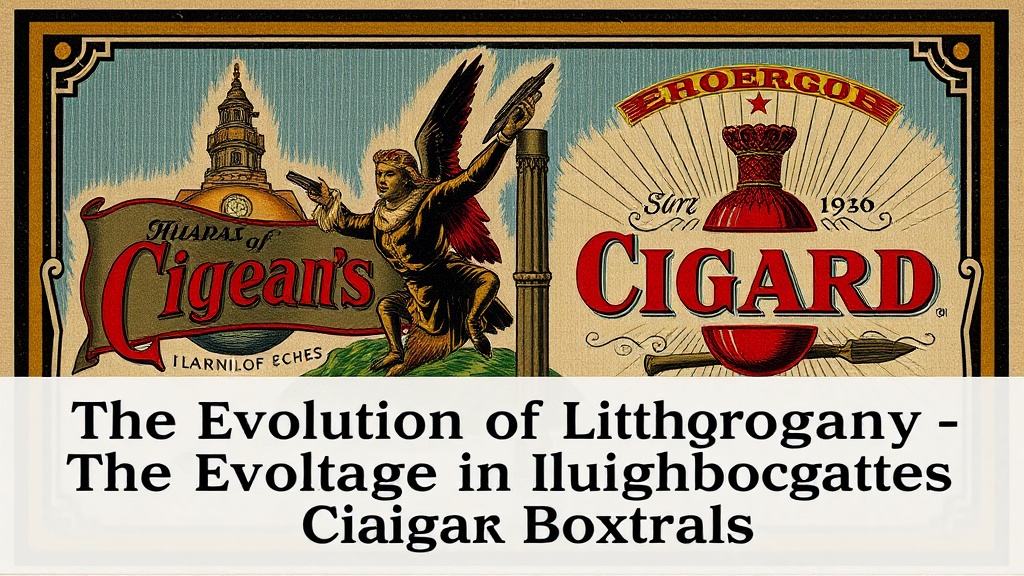
The shift to chromolithography is where things get interesting for the serious collector. It’s where the colors become rich and deep. If you find a label with deep reds and lush greens that look almost three-dimensional, you've found a chromolithograph. These are often the "crown jewels" of a paper collection because they represent the peak of 19-century printing technology.
How can you identify a high-quality lithographic label?
You identify high-quality lithographic labels by looking for fine color layering, smooth gradients, and a lack of "registration" errors. Registration refers to how well the different color layers line up with the central image. In lower-quality prints, you might see a tiny sliver of white or a slight blur where the red ink overlaps the blue ink. High-end labels from prestigious brands have near-perfect alignment.
Another way to tell is by the texture of the paper. High-quality lithography often utilized a heavier, more textured stock to hold the ink. If the paper feels flimsy or overly smooth, it might be a later, more modern reproduction or a cheaper offset print. Many collectors also look at the "grain" of the image. A true lithograph has a certain organic feel that modern digital printing simply cannot replicate.
I often tell people to use a magnifying glass—not a high-powered microscope, just a decent jeweler's loupe. Under magnification, a digital print looks like a series of tiny, uniform dots (the halftone pattern). A vintage lithograph, however, will show a more fluid, continuous-tone appearance. This is a fundamental distinction when you're trying to verify the age of a piece. It’s also worth noting that many collectors worry about the longevity of these colors. If you aren't careful, UV light can bleach those beautiful pigments. I've written a detailed guide on protecting your labels from sunlight damage, which is a vital read if you want these colors to last another hundred years.
| Feature | Woodblock | Chromolithography | Modern Offset |
|---|---|---|---|
| Detail Level | Low (Bold/Simple) | High (Fine/Intricate) | Very High (Uniform) |
| Color Range | Monochrome/Limited | Rich/Layered | Highly Precise/Digital |
| Texture | Rough/Carved | Smooth/Painterly | Flat/Consistent |
| Typical Era | Early 1800s | Mid-to-Late 1800s | 20th Century+ |
Why does the printing method affect the value?
The printing method directly dictates the rarity and the aesthetic appeal of the label, which are the two primary drivers of market value. A hand-colored woodblock label is a different type of collectible than a mass-produced chromolithograph. While the chromolithograph is more "beautiful" in a traditional sense, the sheer age and primitive nature of a woodblock can sometimes command a premium among certain niche historians.
The "Golden Age" of the cigar box—roughly 1870 to 1910—was defined by the explosion of chromolithography. During this time, companies like Cigar brands used these labels as high-end marketing tools. Because these labels were often part of a disposable packaging system, many were thrown away or worn out by use. This makes a well-preserved, high-quality lithographic label much rarer than a standard paper scrap. If the printing is exquisite, the value climbs. If the printing is messy or poorly registered, the value stays low regardless of the brand name.
It’s also important to consider the material. Lithography requires specific ink densities. If a label has survived in a state where the colors are still vibrant, it’s a sign of both high-quality original production and excellent preservation. This is why many collectors focus on the "visual pop" of a piece. A dull, faded label—even if it's a rare brand—is often less desirable than a bright, striking one. This is why proper display is so important. If you want to showcase your finds, you might want to look into seven clever ways to show off a vintage cigar box collection without compromising the integrity of the paper.
The technicality of the print is the soul of the object. When you're looking at a piece, don't just see a label. See the chemical reaction of oil and water, the heavy stone used to press the ink, and the craftsmanship of the artists who drew the original designs. That's where the real history lives.
"The transition from relief to lithography wasn't just a change in manufacturing; it was a revolution in how a brand could communicate its identity through a single sheet of paper."
As the industry moved toward the 20th century, the art of the label became more standardized. The experimental, lush quality of the lithographic era gave way to the efficient, high-speed world of offset printing. While the later pieces are often more "perfect," they frequently lack the character and the tactile depth that makes 19th-century lithography so captivating to the modern collector.